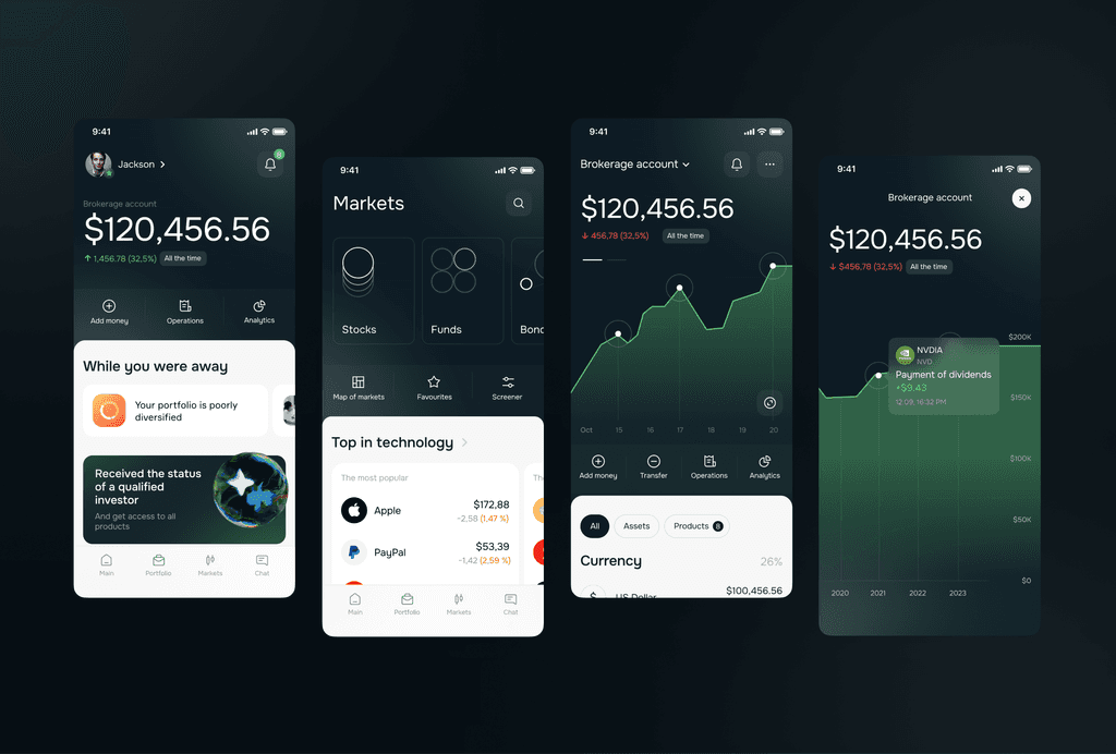
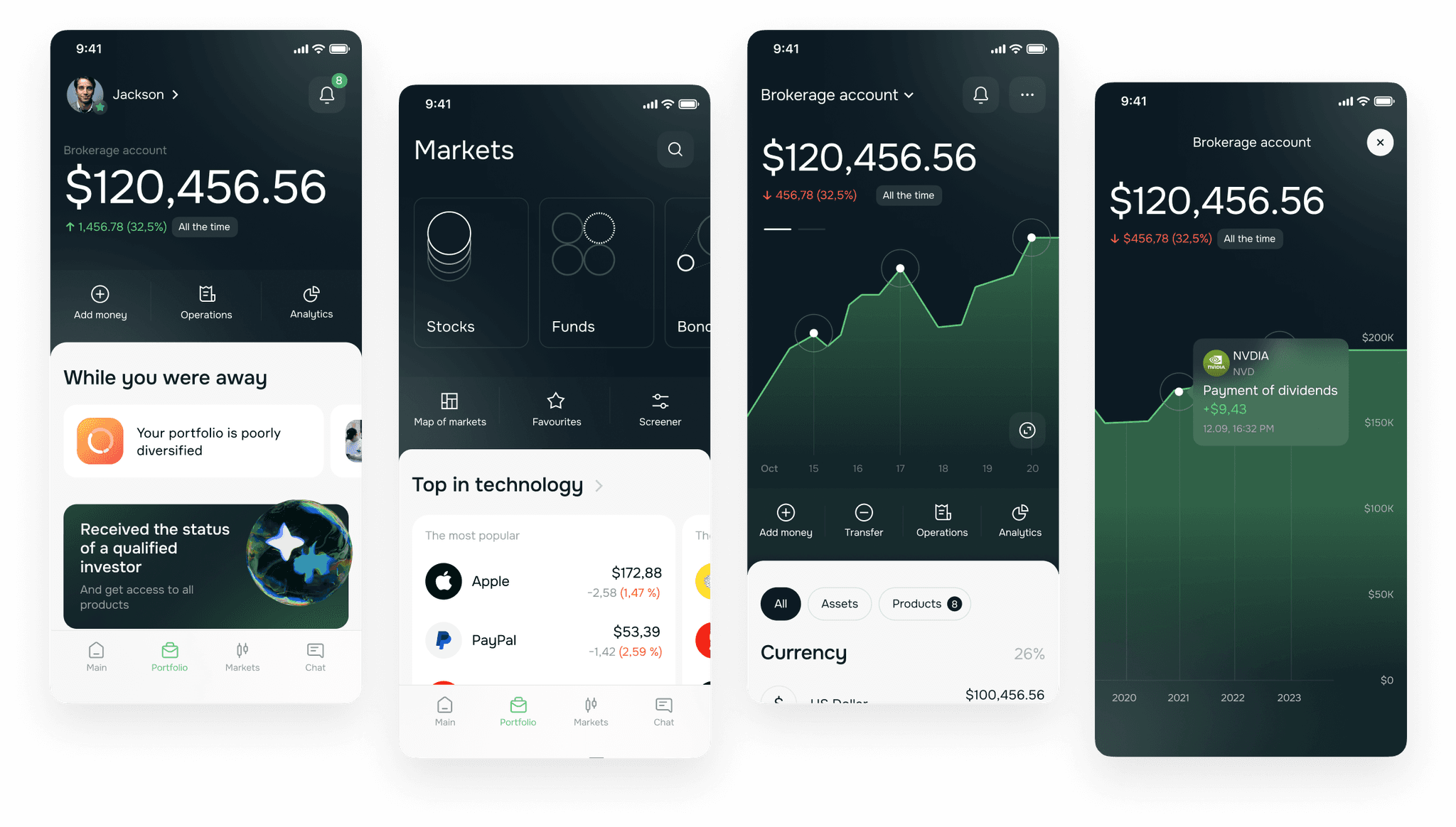
Investment mobile app for ITI Capital
Website
ITI Capital based in the UK. It's an investment company primarily focused on premium clients. They specialize in the sale of Pre-IPO, IPO, complex model portfolios, and other products.
Deliverables
UX design, UI design, Research, Prototype, Mobile app
Role
Senior Product Designer
Timeline
May 2022 → August 2022
1. Problem/Task
I worked on redesign of the mobile app because the old one had limited features, users could only to check their balance and sign some documents.
We identified this problem during market research when we noticed that our competitors had many features, such as buying and selling stocks within the app, the ability to view analytics for investment portfolios, read some news, and chat support through their mobile apps.
The goal was to design a new mobile app with more features for our audience also to attract a younger audience.
2. Design process
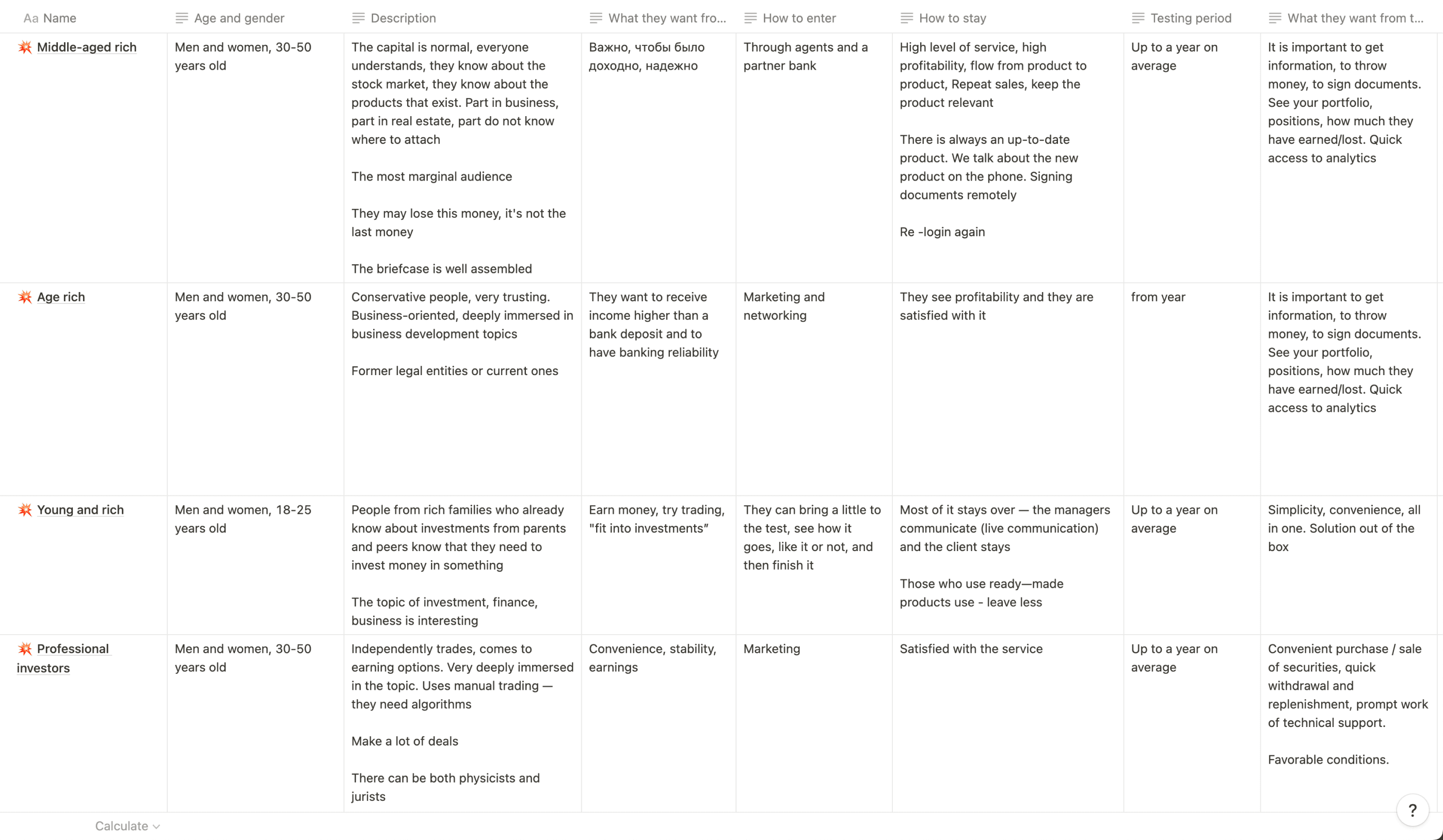
2.1. Audience
The first thing I did was to define the categories from our audience.
2.2. Context and needs
Then I conducted 15 interview with various role segments of the audience to understand what they context and need.
😜
I can't use this app because there aren't enough functions for me.
😉
I follow news related to my portfolio stocks every day
🙂
When I buy a stock, it's important to see the chart. Currently, I cannot view it in your app, so I open Tinkoff (a direct competitor) simultaneously and check it there.
🙃
I use the mobile app every day to understand how my portfolio has changed in my absence and check stock quotes to decide what to sell or buy
🤪
I monitor market index changes daily to understand the current market situation
😝
When choosing an app, I pay attention to the availability of convenient charts.
This confirms our initial insight. For our audience, it is more convenient to use the mobile app. Some of our existing clients use a competitor's app to fulfill certain needs. Meanwhile, potential clients may never come to us as we lack a mobile app. Additionally, after conducting research, we gained insights for future features such as news, market updates, convenient charts, etc.
2.3. Competitors
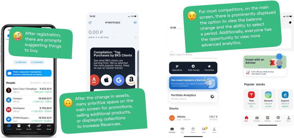
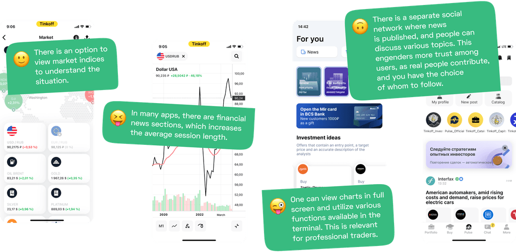
Next, I explored how various competitors implement features that users engage with. Here I found some interesting ideas.
Firstly, the main screen is more than just a portfolio, it's also a place for promoting products or stocks. Secondly, all of them have a convenient chart with various functions needed for professional traders. Thirdly, some apps have market indices, essential for traders to understand the situation. Fourth, there is financial news that users say they often read. Additionally, some competitors have a financial social network where people can discuss. Respondents mentioned that they like and use it.
2.4. Product Architecture
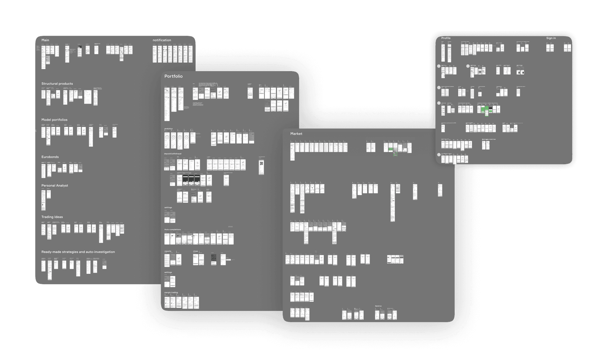
After that, I began working on the user flow and product architecture of the upcoming app. Since there were many screens, I needed to make sure I didn't miss anything and coordinate everything with the team.
We have divided the product into five main sections: main, portfolio, products, markets, chat, and profile
Main
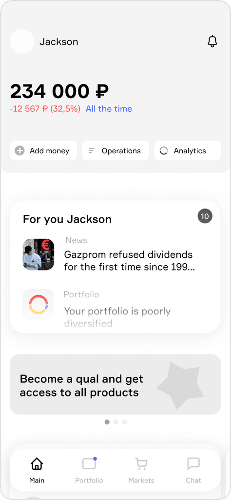
Key information for users (data from their portfolio). Main functionalities: depositing funds, viewing transaction history, and navigating to the analytics section. Financial news. Our core products. Educational content for users who face challenges.
Portfolio
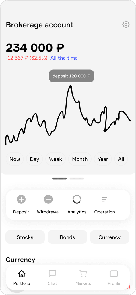
Detailed portfolio information, overall portfolio changes, and stocks. Users can view various accounts, open/close accounts, and customize account settings.
Markets
All information about the market is provided, including buying stocks, funds, currency, etc. Users can access market indices, search for stocks, explore collections of stocks, and stay updated with financial news.
Profile
Gamification, other documents, the ability to take qualification tests for investor status, tariff changes, support chat, and the bank's contact information, etc.
Analytics
The ability to analyze portfolio changes in more detail, including by sectors, assets, companies, currencies, over time, etc.
2.5. Prototype
I created multiple low-fi sketches and prototypes to discuss with the team about features.
2.6. Research
So, I'm going to conduct usability research on our prototypes. In this research, we aim to understand how easily our audience can use our app and perform essential actions such as buying/selling securities, comfortably using analytics, funding/withdrawing money from their accounts, understanding how to purchase investment products, comprehending their values, and ensuring that the app's functionality is sufficient for them.
We also want to focus on three main concerns about the app:
The primary goal of the company is to sell investment products like modular portfolios and structured products. We struggled to decide on the main screen of the mobile app for a long time, balancing the needs of the business and users.
For users, checking their balance and stocks is important, while for the business, it's about selling products. We decided to explore this through interviews.
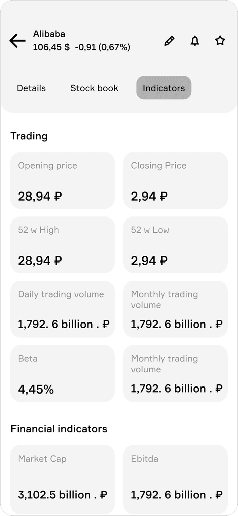
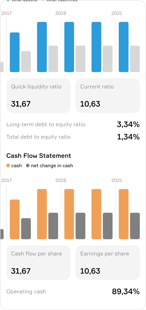
The next issue concerns the stock selection screen. It was crucial to understand what information on this screen is important for users and what is less so, and how they approach their choices. During discussions, we added various multipliers for selection that were not available in other investment apps. It was important for us to ensure that these multipliers were not only important for us but also for our audience.
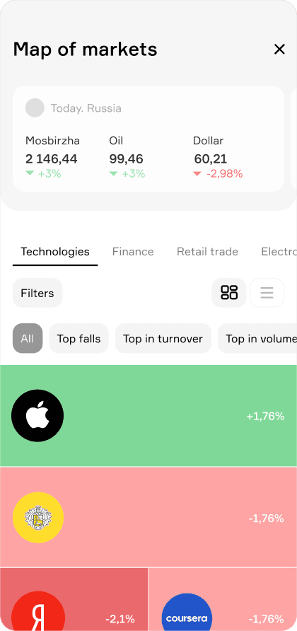
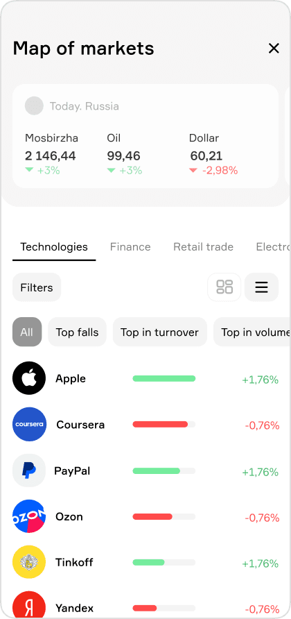
The third issue is related to introducing several features that our competitors didn't have. One of these was 'Market Information,' including a Stock Market Map and Market Indexes. However, we were concerned that this might not be what our audience needed, and we weren't sure if everything would be clear to them, as we hadn't seen such features in our competitors' mobile apps.
Throughout the research, I had a lot of ideas, documenting them in a table. After the research, we have come to the understanding that users can perform essential actions in the application, and only minor adjustments are needed. These adjustments include adding additional filters to the analytics, separating fund deposits and withdrawals for clearer understanding, providing the ability to view graphs on the purchase screen, etc.
What about our main concerns?
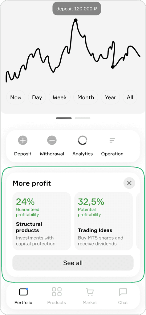
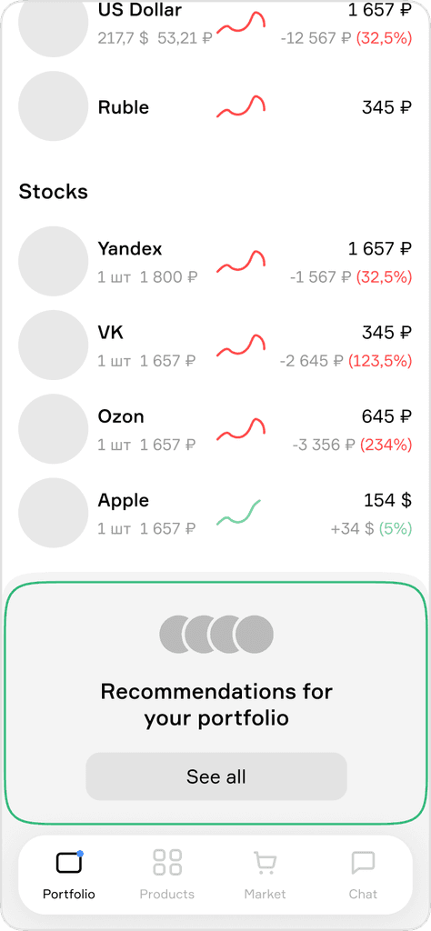
Users would like to see information about their portfolio on the main screen. Some of the users didn't understand what kind of products are presented here at all. Some said that they would never buy these products because they are not interesting and it's not clear why they are on the main screen.
And we have decided to move the portfolio to the main page but complement the list of securities already in their portfolio with promotional materials for our products, providing the option to hide them if not interested.
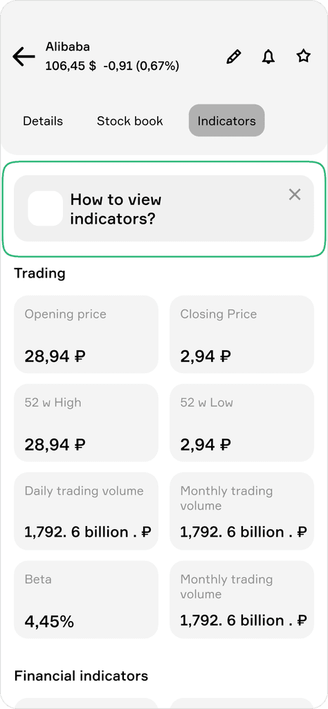
The segment of young and promising individuals is not familiar with how to interpret indicators. They tried to understand the metrics in the application earlier but couldn't figure out how to read them correctly.
We added educational content for users who need it. They can choose to hide it. However, this content will also be accessible in the profile.
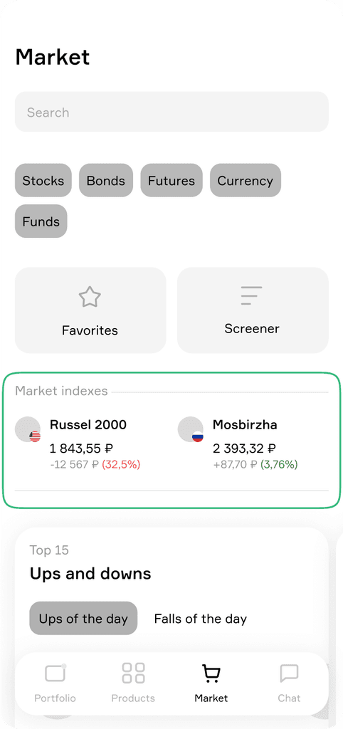
We have decided to move the market indexes to the market page because this content is important to some audience.
3. Design screens
4. Summary
5. Reflection
I've learned to work quickly under tight deadlines to prepare prototypes and test them with our users as soon as possible. I learned to conduct research and create a concept for the same project simultaneously due to time constraints. Constraints are stressful but sometimes helpful.
If we had unlimited time or resources, we might still be in the middle of analysis or exploration paralysis.
